RaceTrac
RaceTrac, via Digitas North America · 2024

Overview
A ground-up redesign of the app 1M+ commuters use to fuel up, save, and get in and out — I owned the core loop as one of three designers on the team.
Team
One of three designers, alongside a PM, engineering, and a dedicated UX researcher
Timeline
~9 months · Shipped May 2024
My Scope
Onboarding & rewards enrollment · Store search, store detail & fuel pricing · Digital ordering · Transaction history & notifications
Result
App Store rating rose from 2.5 to 4.8 stars following launch

The Problem
The existing app had no rewards program, no digital ordering, and stability issues that eroded trust — it sat at a 2.5-star rating. For RaceTrac's core users, that mattered more than it might for a typical retail app: these are people making quick decisions at a pump or glancing at a screen between other tasks, not settling in with full attention. Every unnecessary step or unclear screen had an outsized cost.
My Point of View
Reduce the number of decisions someone has to make when they're not fully paying attention to their phone — at a pump, mid-commute, between other tasks. That meant fewer required fields at signup, pricing and store information readable at a glance, and an ordering flow built around interruption rather than continuous focus.
Hero Flow 1
Onboarding & Rewards Enrollment
Problem
Signing up for rewards was the first ask made of a brand-new user with no track record with the app yet — every extra field was a reason to abandon.
Approach
I restructured enrollment to defer non-essential steps until after someone had gotten value from the app once, cutting the initial form to the minimum needed to create an account and start earning.
Validation
Our UX researcher ran usability sessions across several rounds; I used her findings to adjust field order and copy before launch.

Hero Flow 2
Store Search, Store Detail & Fuel Pricing
Problem
Drivers need to decide, often quickly, which location and fuel grade to use — and pricing pages are inherently data-dense.
Approach
I designed a fuel-type icon system for the pricing screen so grade and price could be scanned at a glance rather than read line by line, and restructured store detail pages to foreground what's relevant in the moment — price, distance, amenities — over less time-sensitive content.
Craft note
The icon system is a detail I'm proud of. It had to stay legible and consistent across every fuel grade RaceTrac sells, at a size someone could actually read while walking up to a pump.

Hero Flow 3
Digital Ordering
Problem
Digital ordering meant designing for a wide range of states — different fuel types, in-progress orders, failures — that the previous app never had to handle.
Approach
I mapped the flow's states end-to-end and designed for interruption: an order started at the pump might be picked up again at the register, or fail and need a clear recovery path.

System Contribution
Beyond the individual flows, I built the fuel-type icon set as a reusable system rather than one-off pricing graphics — the kind of detail that's easy to skip under deadline but pays off in consistency across every store and every price update.

Also in Scope
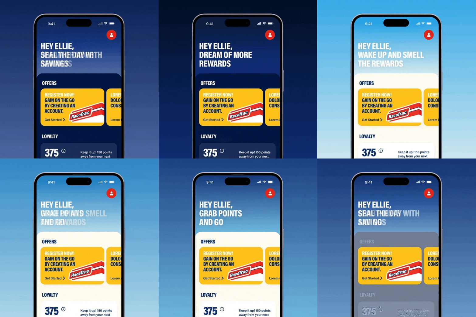
Transaction history and notifications — quick-scan account activity and rewards alerts — round out the experience I owned, alongside seasonal splash screens for promotional moments.
Outcome
The redesign — across all three designers' work — lifted RaceTrac's App Store rating from 2.5 to 4.8 stars following its May 2024 launch. The flows I owned (onboarding, store/fuel discovery, ordering, account activity) are the ones most users touch on every visit, and directly addressed the gaps — no rewards, no digital ordering, low stability — that had been holding the previous rating down.
Reflection
Research on this project was owned by a dedicated UX researcher rather than by me directly — I worked from her synthesized findings rather than moderating sessions myself. It's a gap I want to close going forward: sitting in on more raw sessions, not just the readout, so I can catch nuance that doesn't always make it into a summary.
Next Project
Snackworks→